Brand Identity, Packaging, Social Media
Inspired by the Greek word "Anthos," meaning blossom, the café embodies a philosophy of sharing joy, love, and good food. This cafe is based out of Gurgaon in India

Logo - The Concept
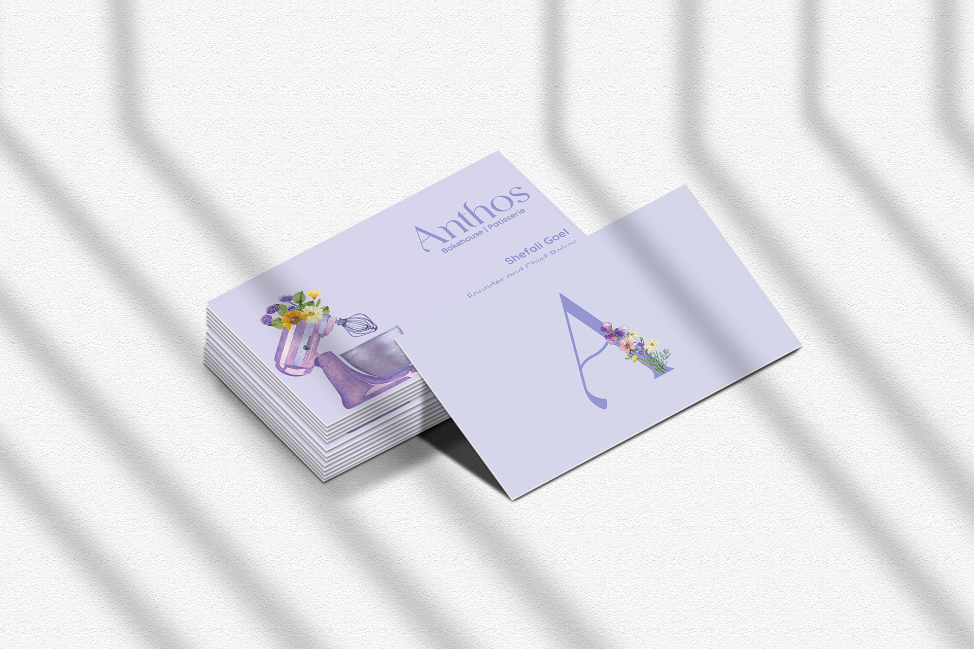
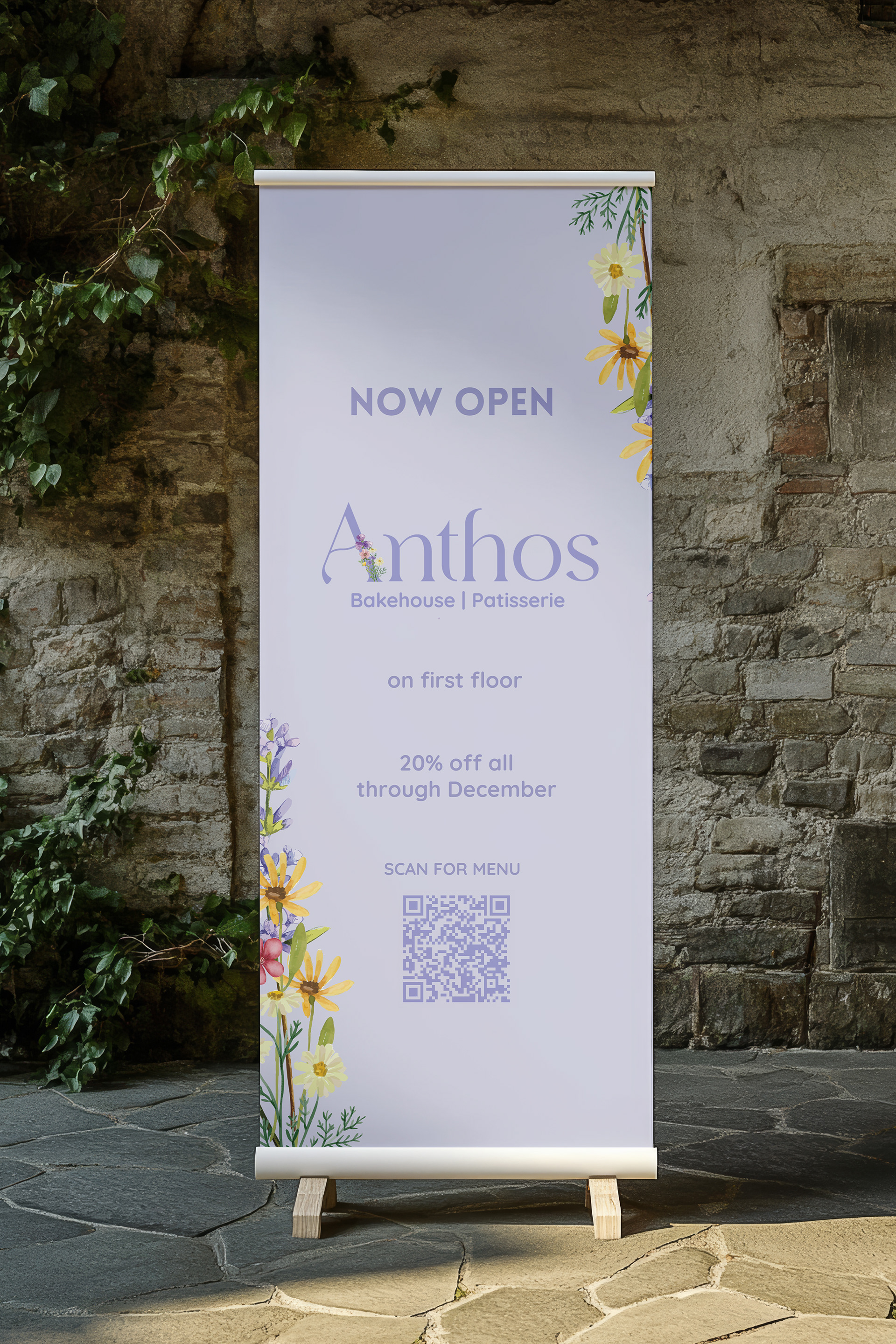
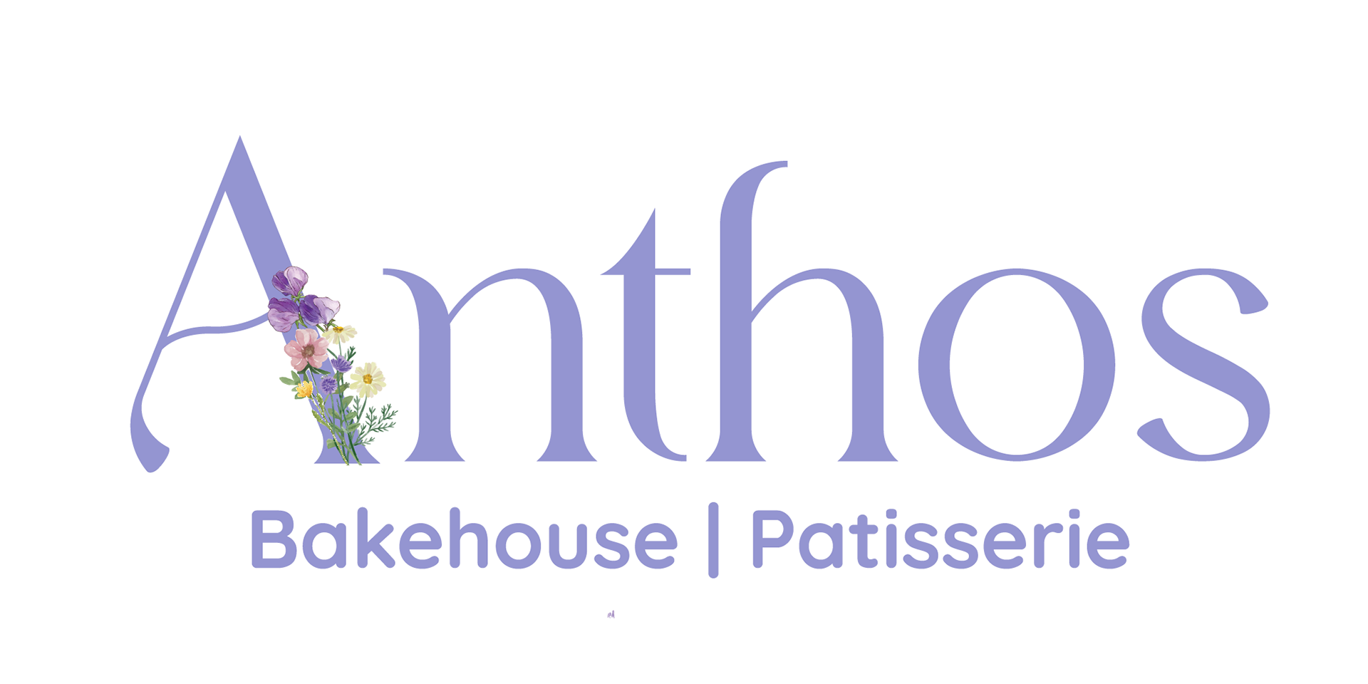
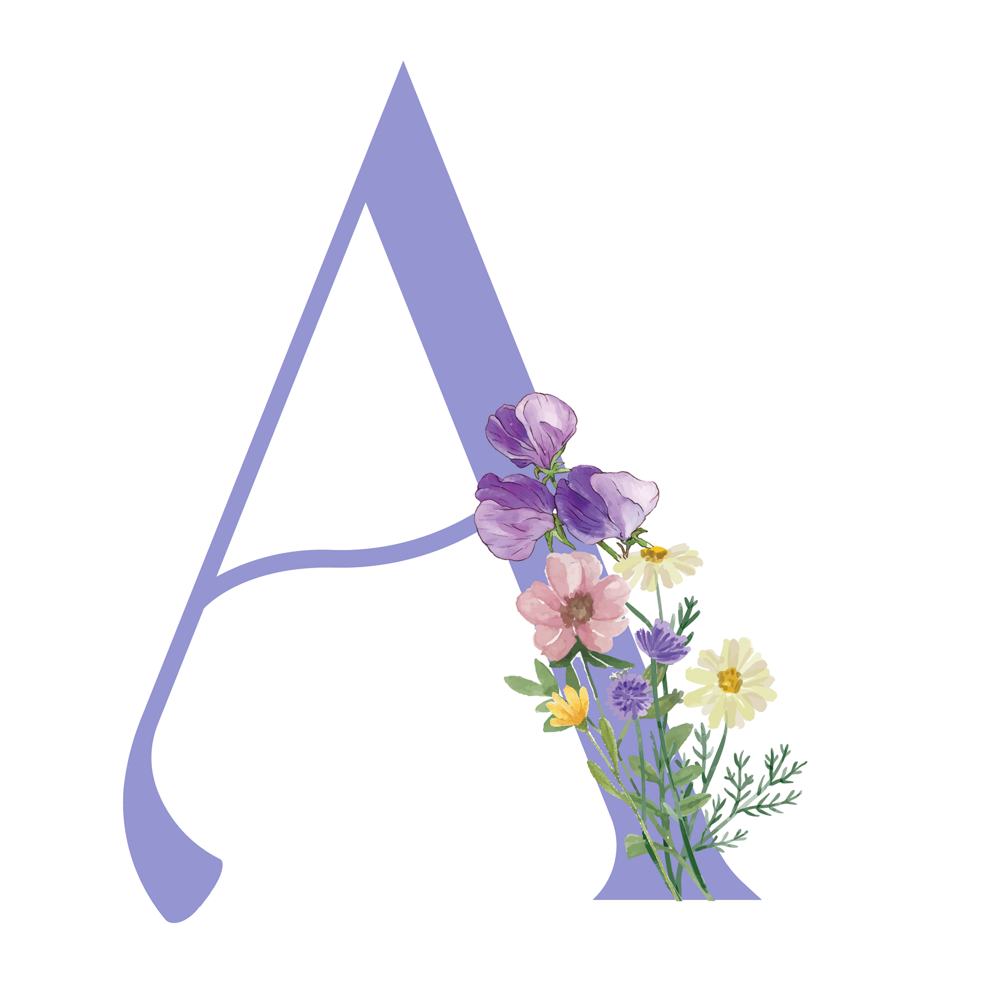
The logo design draws inspiration from the word Anthos, which means "flowers" in Greek. Watercolor florals were thoughtfully integrated into the letter ‘A’ to reflect the café’s warm, artisanal charm and add a soft, elegant touch. The floral ‘A’ also functions as a versatile submark, allowing it to be used as and when required across various branding applications.
A playful font with romantic curves and a refined, elegant structure was chosen to strike a balance between sophistication and charm. Its timeless appeal makes it well-suited for both contemporary and classic aesthetics, perfectly complementing the overall brand identity.
Primary Logo
Monogram
Brand Colors
The brand colors for Anthos Café were thoughtfully chosen to reflect the dual nature of its menu—serving both desserts and savoury delights. Soft lavenders and their deeper shades represent the delicate, indulgent charm of the dessert section, while the calming greens draw inspiration from fresh, wholesome ingredients in the savoury offerings.
The light lavender—Lilac Veil—was used as the primary color across the branding to create a soft, inviting impact, while the greens were brought in to add balance, freshness, and depth throughout the visual identity.

Icons/Elements
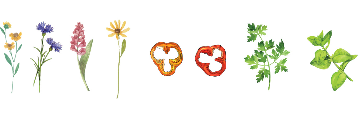
Different floral motifs were applied across various branding materials, ensuring a cohesive and inviting look throughout the café and bakery. For the savoury items, designs featuring different vegetables and herbs were introduced—adding a unique twist that not only aligns with the café's fresh and wholesome offerings but also carries forward the floral feel through the delicate shapes of herbs.
Different floral motifs were applied across various branding materials, ensuring a cohesive and inviting look throughout the café and bakery. For the savoury items, designs featuring different vegetables and herbs were introduced—adding a unique twist that not only aligns with the café's fresh and wholesome offerings but also carries forward the floral feel through the delicate shapes of herbs.
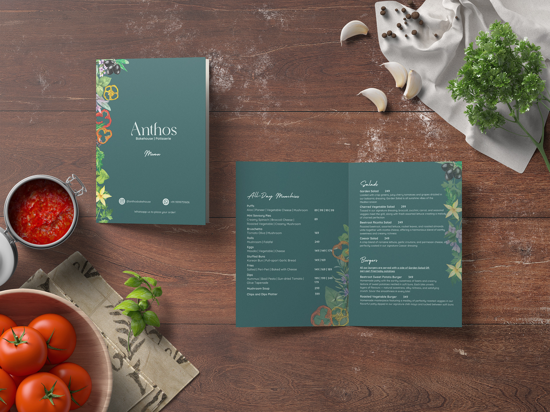
Menu
As per the color palette, green tones along with vegetable and herb elements were used for the savoury food menu, while lavender shades and floral motifs were used for the dessert menu.
As per the color palette, green tones along with vegetable and herb elements were used for the savoury food menu, while lavender shades and floral motifs were used for the dessert menu.

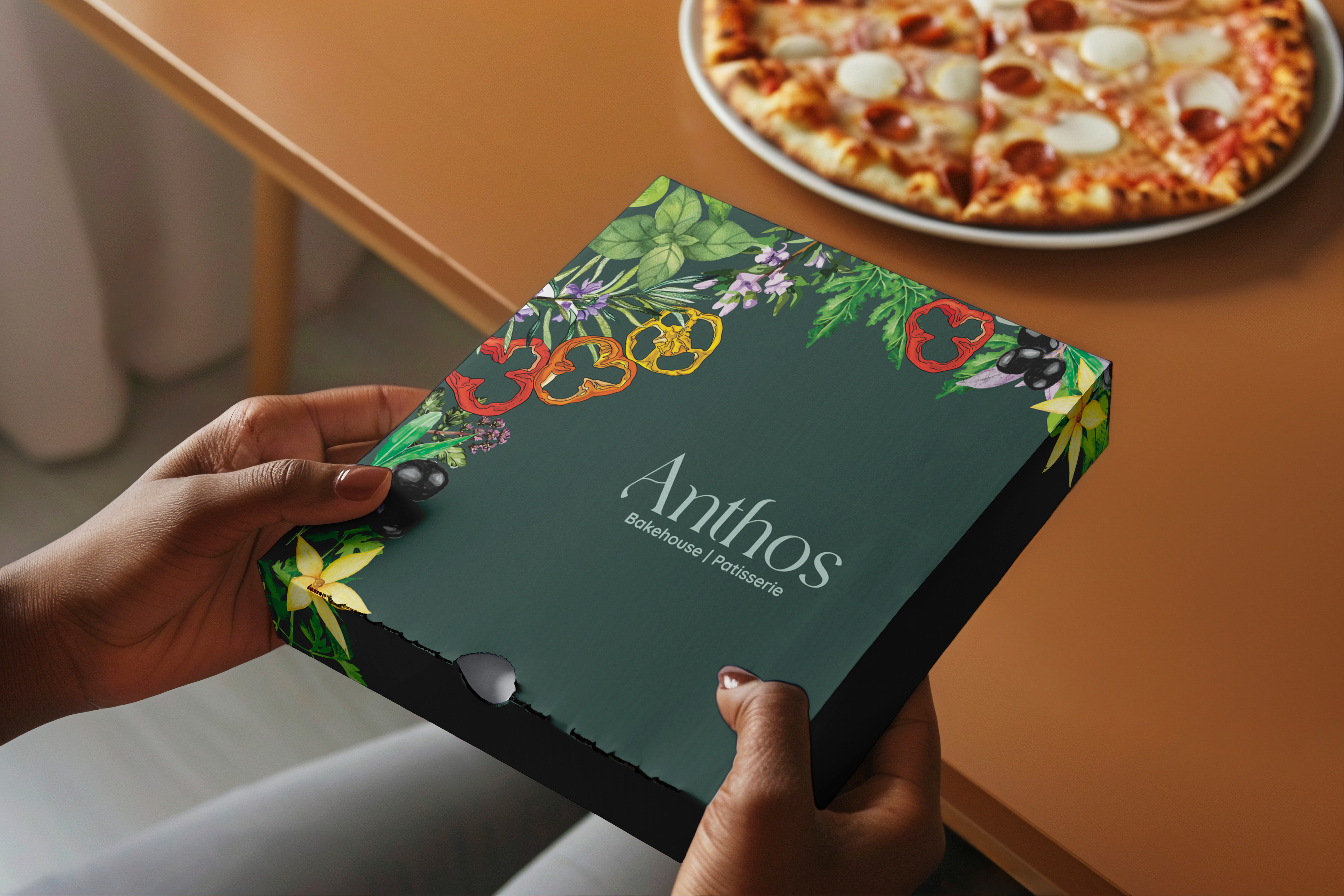
Packaging
In line with the color palette, the packaging design followed the same visual language—greens paired with illustrations of vegetables and herbs were used for savoury items, while soft lavender tones and floral motifs were featured on dessert packaging. This approach ensured a cohesive yet distinctive look across all product categories.
In line with the color palette, the packaging design followed the same visual language—greens paired with illustrations of vegetables and herbs were used for savoury items, while soft lavender tones and floral motifs were featured on dessert packaging. This approach ensured a cohesive yet distinctive look across all product categories.

Branding