Brand Identity, UI/UX, Social Media
OYoga is an online platform that guides individuals toward holistic wellness by blending ancient yoga practices with modern medicine. Its mission is to support mental, physical, and emotional well-being through an integrative healthcare approach.
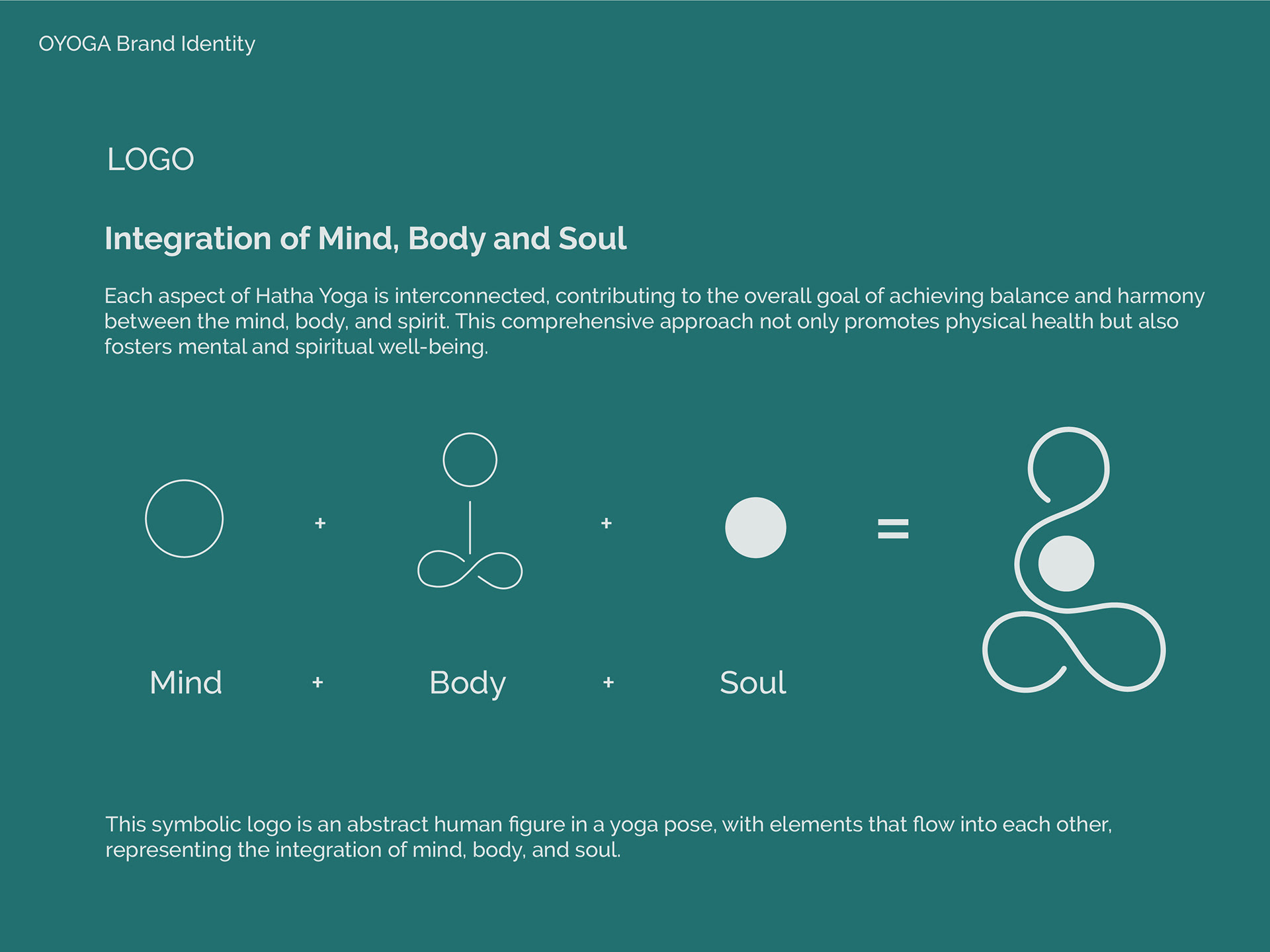
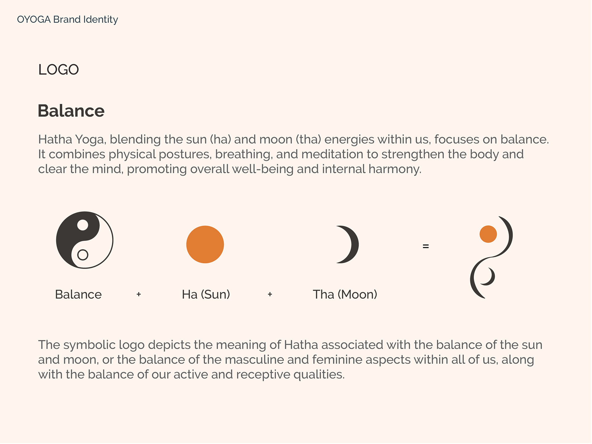
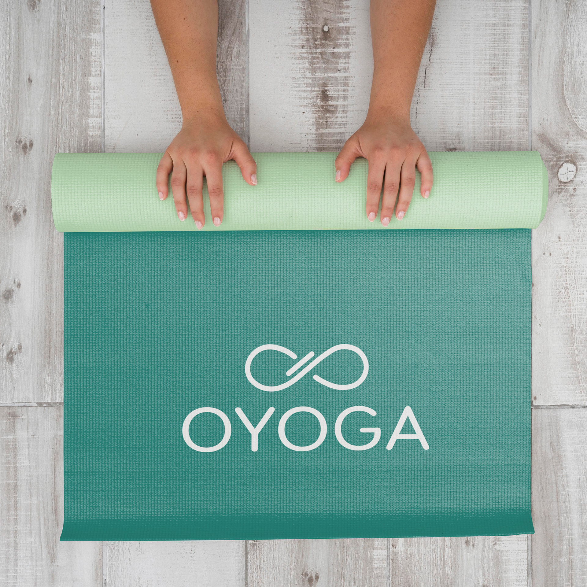
Logo - The Concept

The infinity symbol in the logo represents the continuous flow and balance of physical, mental, and spiritual well-being, which are central to holistic healthcare and yoga. Its smooth and seamless curves embody the idea of interconnectedness, illustrating how various aspects of health are interdependent and work in harmony.
The horizontal line cutting through the infinity symbol introduces the concept of integration. It signifies a point of convergence where diverse elements—such as traditional yoga practices, modern healthcare, and mental wellness—are unified into a single, cohesive approach. This integration highlights the platform’s mission to bring together seemingly separate paths into a balanced and fluid healthcare journey, empowering users to achieve overall well-being.
Together, the infinity symbol and the horizontal line visualize the integrated healthcare approach, where infinite possibilities for growth and healing are anchored in a structured, accessible, and balanced framework. This reflects the platform’s unique value: a seamless blend of ancient wisdom and modern practices for comprehensive wellness.
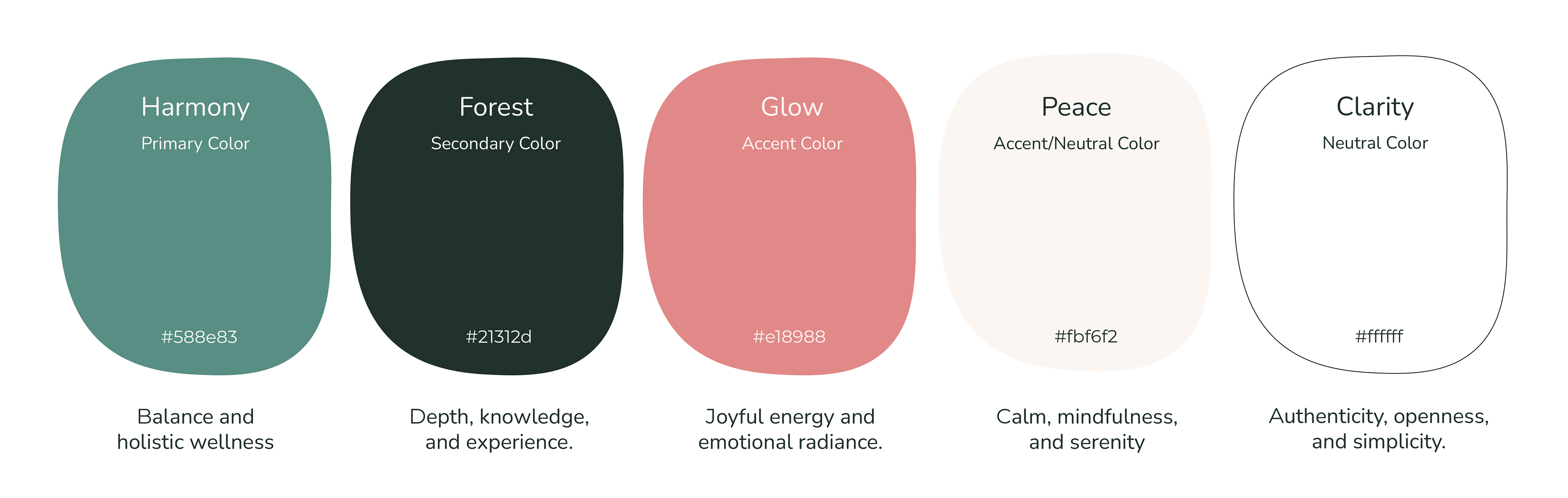
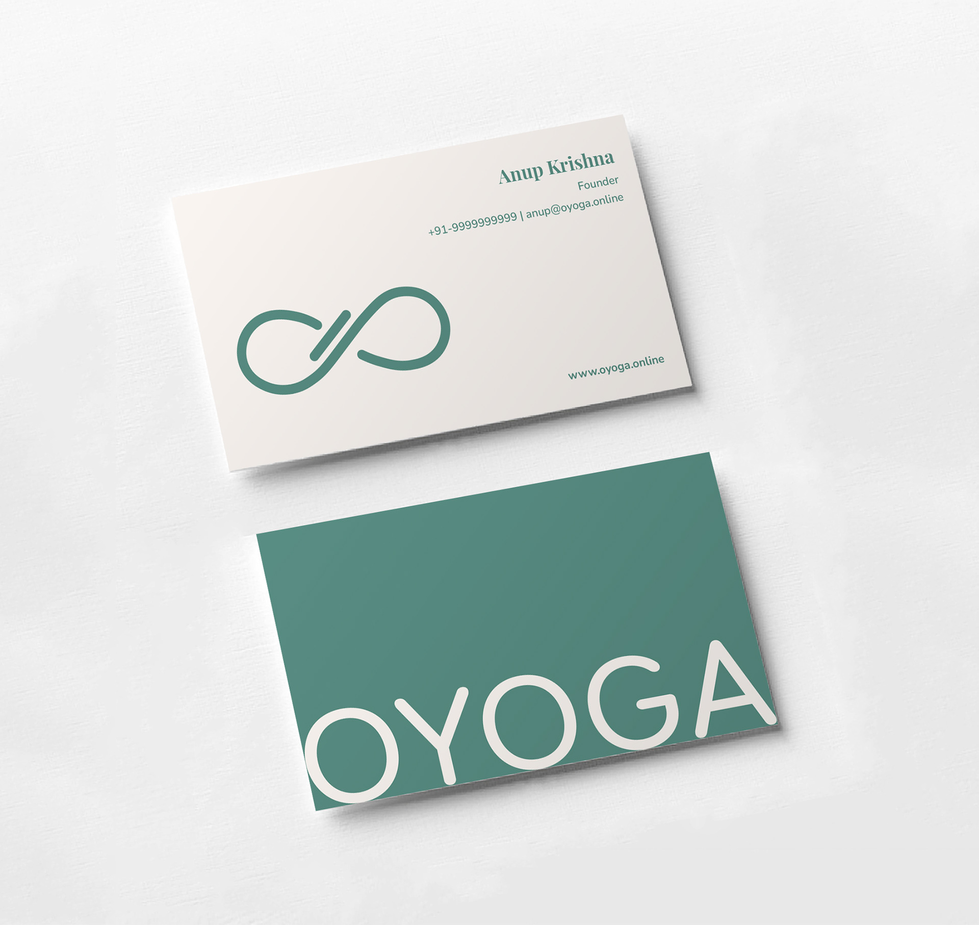
Brand Colors
Green (Harmony) was chosen as the primary color to reflect OYoga’s core values—calm, balance, and well-being. As a soothing, nature-inspired green, it beautifully ties together the brand’s focus on healthcare, yoga, and wellness, creating a sense of harmony and grounded serenity throughout the visual identity.
Green (Harmony) was chosen as the primary color to reflect OYoga’s core values—calm, balance, and well-being. As a soothing, nature-inspired green, it beautifully ties together the brand’s focus on healthcare, yoga, and wellness, creating a sense of harmony and grounded serenity throughout the visual identity.
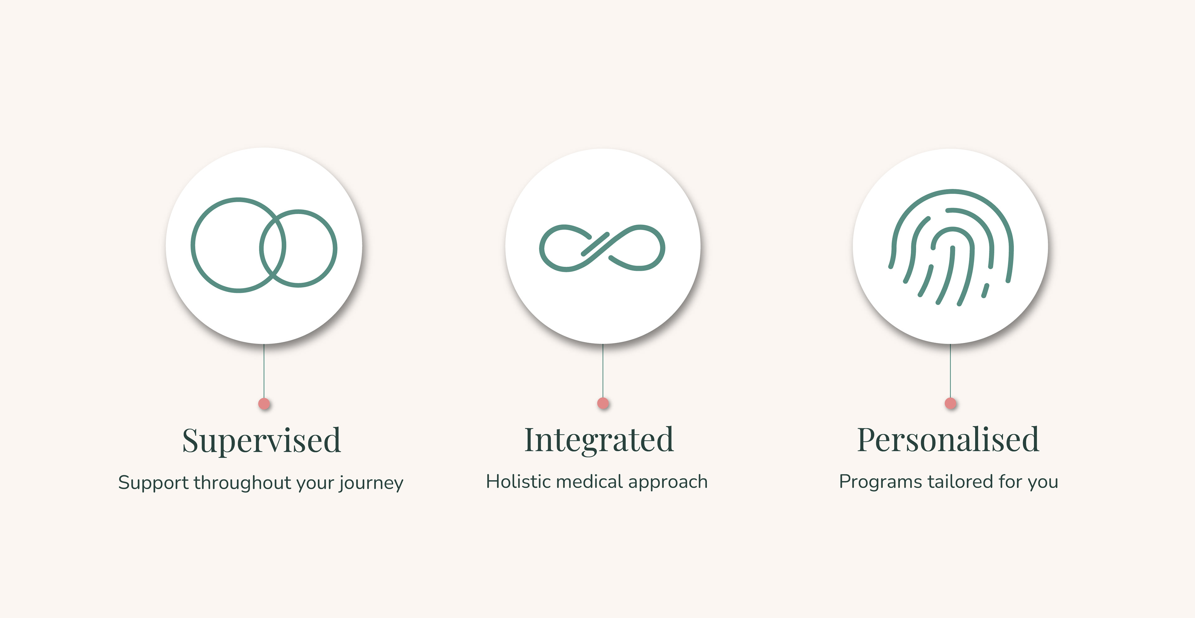
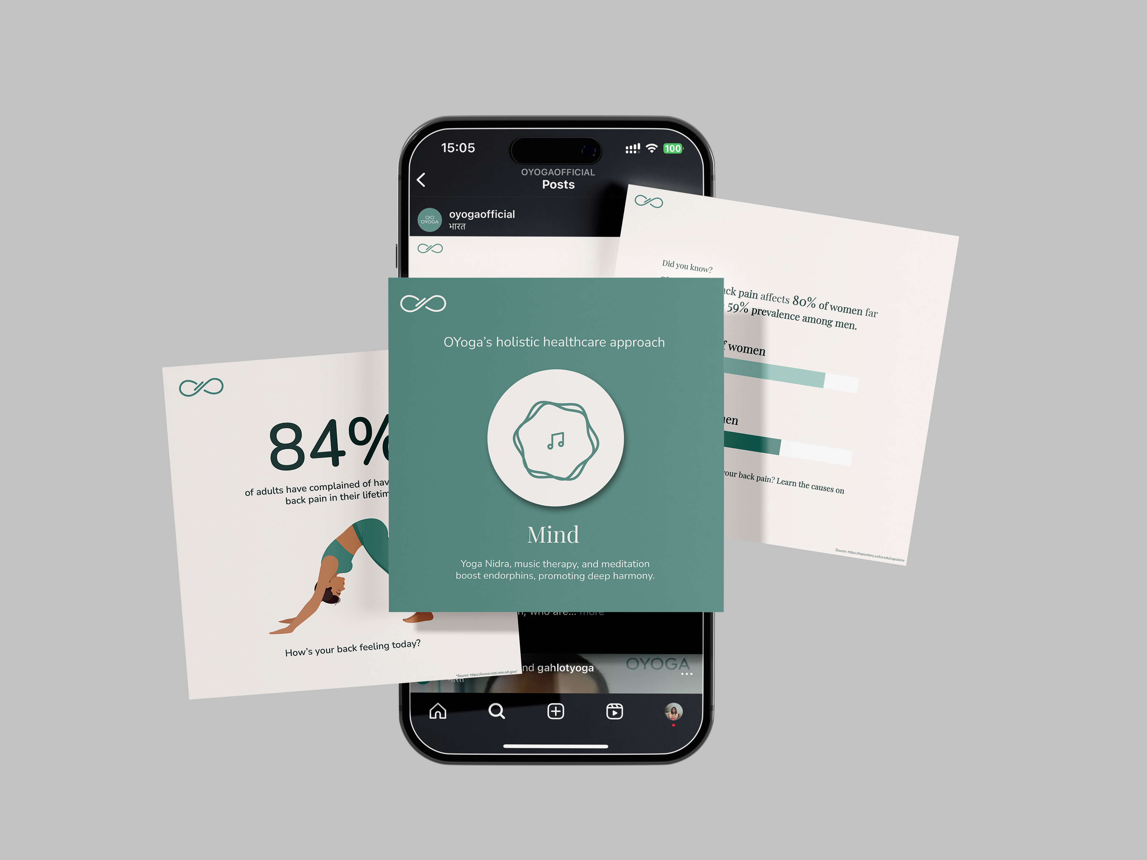
Icons/Elements
To complement OYoga’s clean and minimal aesthetic, we chose line drawings for icons across all branding, reinforcing a sense of calm, clarity, and consistency throughout the design.
To complement OYoga’s clean and minimal aesthetic, we chose line drawings for icons across all branding, reinforcing a sense of calm, clarity, and consistency throughout the design.

UI/UX
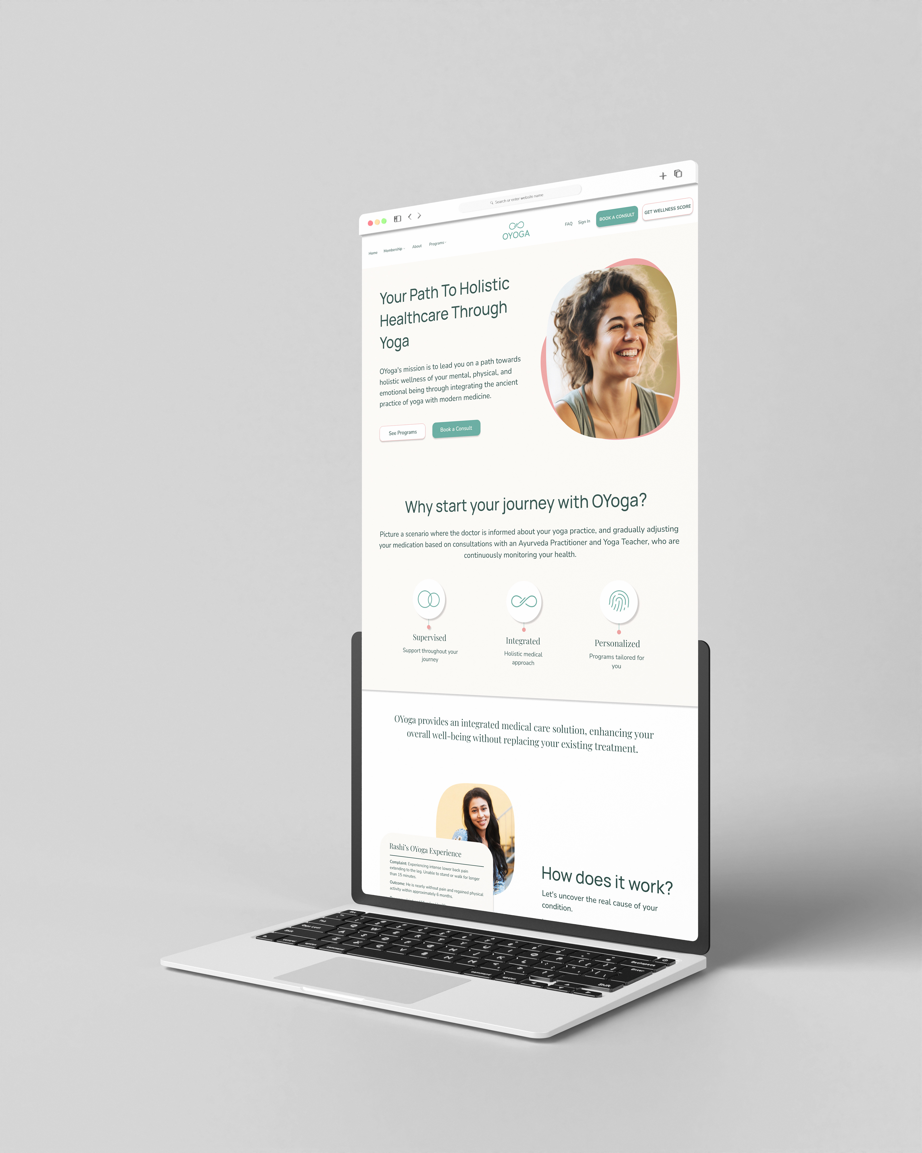
This website was designed to reflect the calm and clarity of yoga through a clean, minimalist layout, soothing visuals, intuitive navigation, and clear calls-to-action.
This website was designed to reflect the calm and clarity of yoga through a clean, minimalist layout, soothing visuals, intuitive navigation, and clear calls-to-action.

Branding
Social Media

Other Concepts