Packaging
Vriksal Naturals is a wet wipes brand based in India, offering a wide range of gentle and effective wipes for every need. From baby care to adult hygiene, including intimate and personal wipes, their products are designed to provide comfort, convenience, and cleanliness for the whole family.
Concept
The Vriksal Naturals face wipes range was designed to feel fresh, approachable, and easy to understand, while catering to different skin types and concerns. The goal was to create packaging that balances shelf appeal with clarity—making it easy for users to identify the right product at a glance, while maintaining a unified and recognizable brand presence across all variants.
Purple served as the unifying base color across the entire range, building strong brand recall and a cohesive look. Each variant was then paired with a second color inspired by its key ingredients
Bold typography ensures the main function of each wipe—Glow, Face, or Acne—is instantly visible on the left side of the pack. The product name is displayed in a clean, modern font that’s both readable and expressive. Additional information such as skin type suitability and key ingredient highlights is laid out clearly, helping customers quickly connect with the right variant.
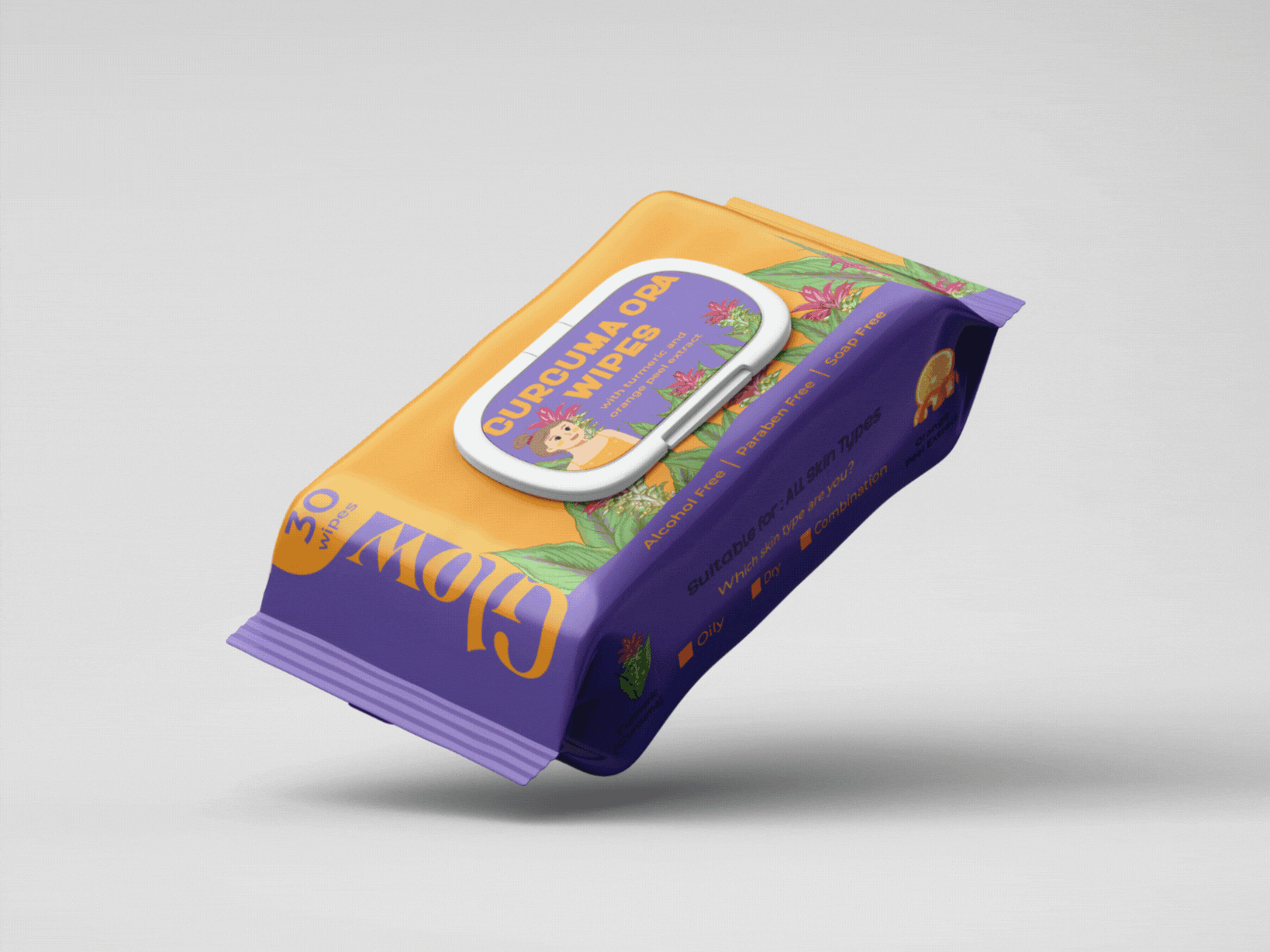
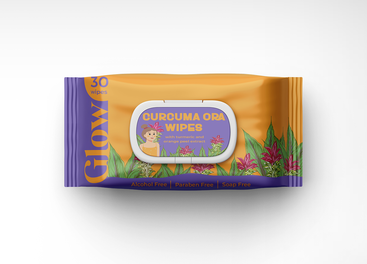
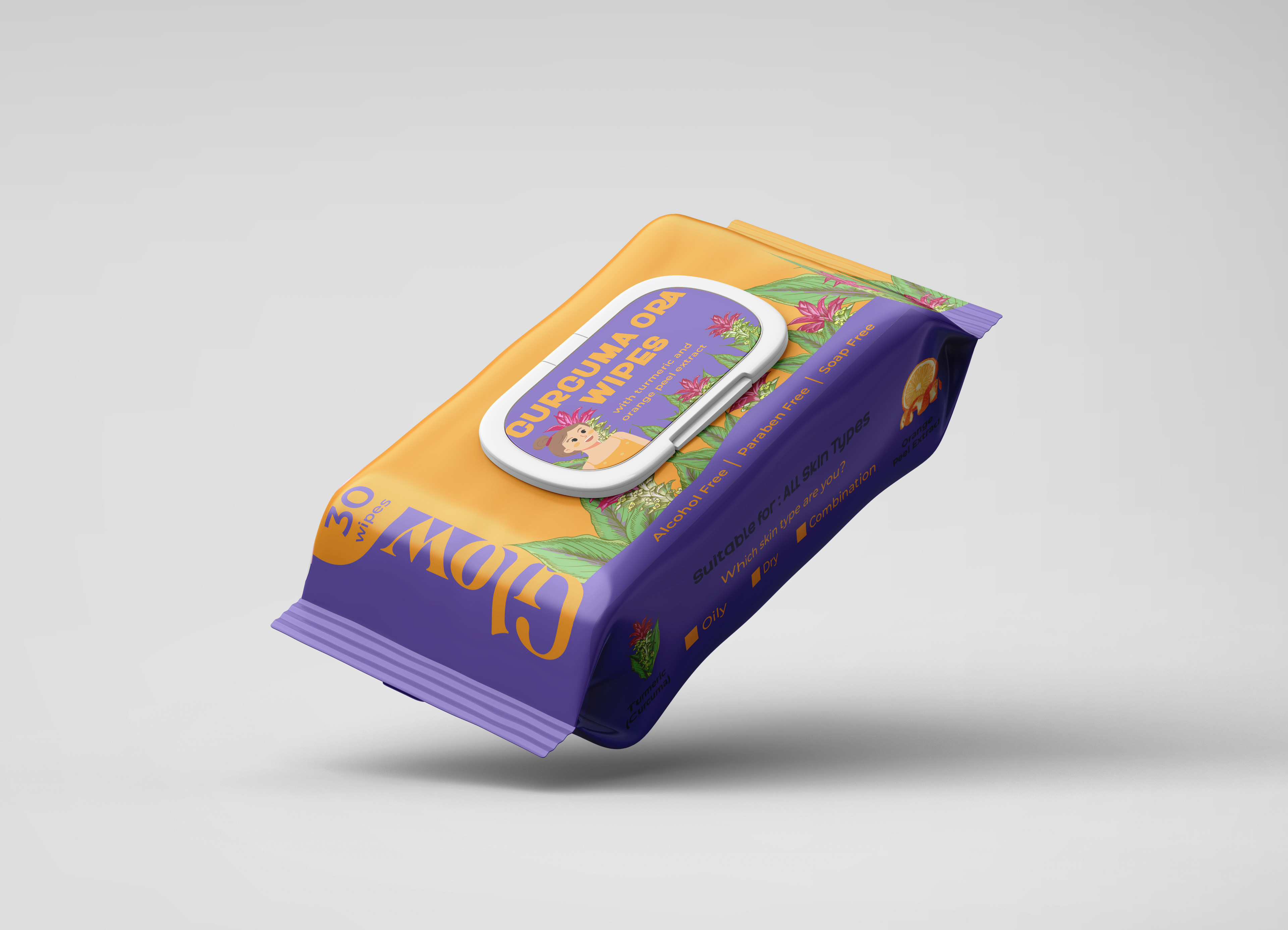
1. Curcuma Ora Wipes
It features botanical illustrations that highlight the key natural ingredients, enhancing the overall visual identity while staying true to the product’s purpose. For Curcuma Ora, vibrant illustrations of turmeric leaves and flowers were used to create a warm and energetic look. A bold turmeric orange was used to reflect the warmth and radiance associated with turmeric, reinforcing the overall appeal of the variant. A playful illustration of a girl appears across the range, adding warmth, relatability, and a consistent human touch that ties the collection together.
It features botanical illustrations that highlight the key natural ingredients, enhancing the overall visual identity while staying true to the product’s purpose. For Curcuma Ora, vibrant illustrations of turmeric leaves and flowers were used to create a warm and energetic look. A bold turmeric orange was used to reflect the warmth and radiance associated with turmeric, reinforcing the overall appeal of the variant. A playful illustration of a girl appears across the range, adding warmth, relatability, and a consistent human touch that ties the collection together.
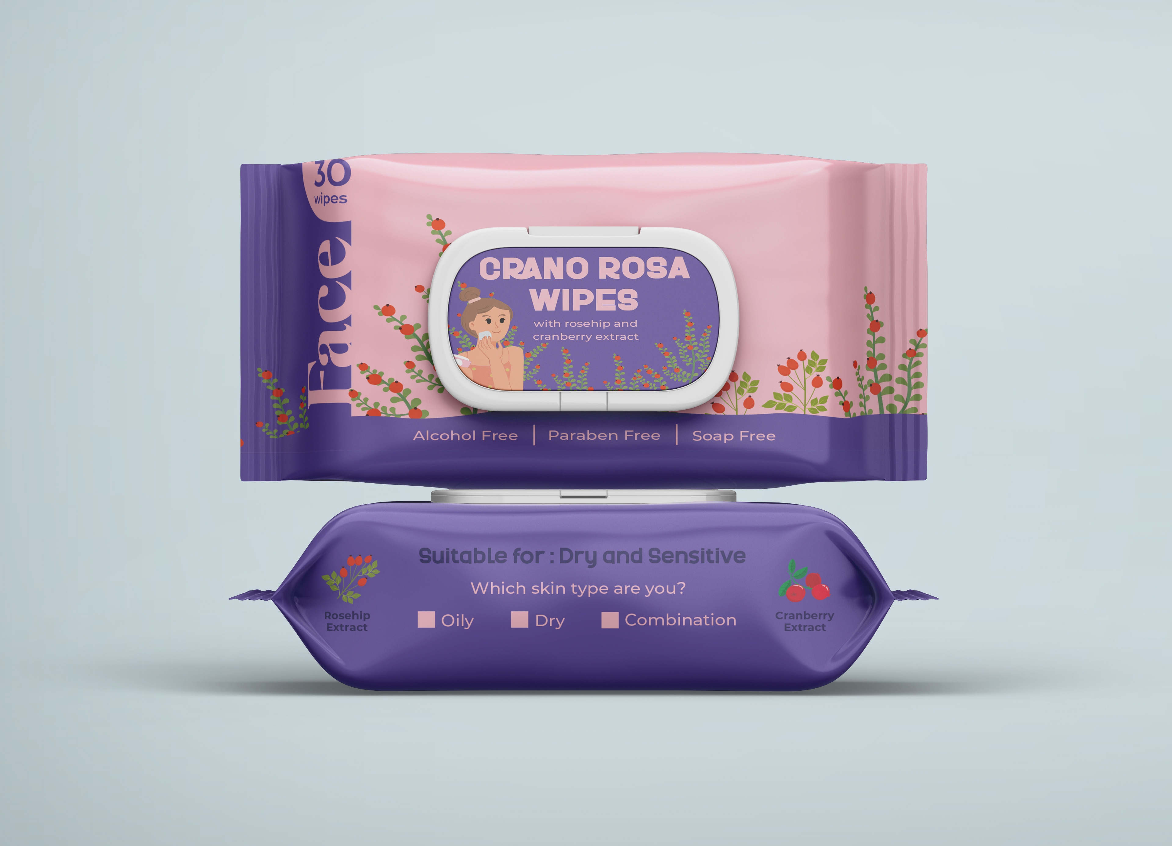
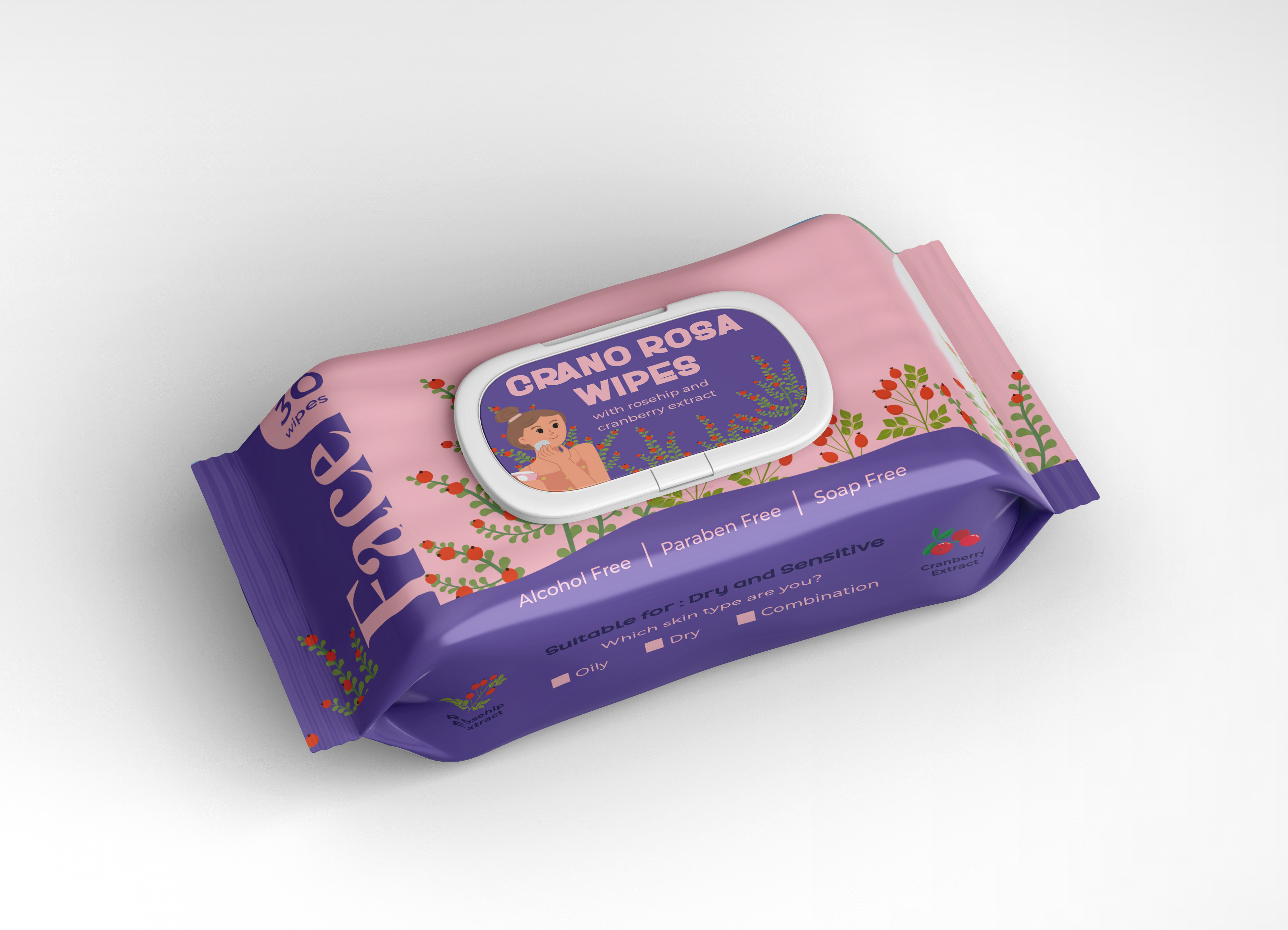
2. Crano Rosa Wipes
For Crano Rosa, delicate illustrations of rosehip and cranberry branches were used to create a soft and nurturing look. A gentle rose pink was chosen to reflect the soothing nature of the ingredients and the calming experience the product offers. The presence of a cheerful illustrated girl adds a friendly, human element that brings warmth and personality to the design.
For Crano Rosa, delicate illustrations of rosehip and cranberry branches were used to create a soft and nurturing look. A gentle rose pink was chosen to reflect the soothing nature of the ingredients and the calming experience the product offers. The presence of a cheerful illustrated girl adds a friendly, human element that brings warmth and personality to the design.
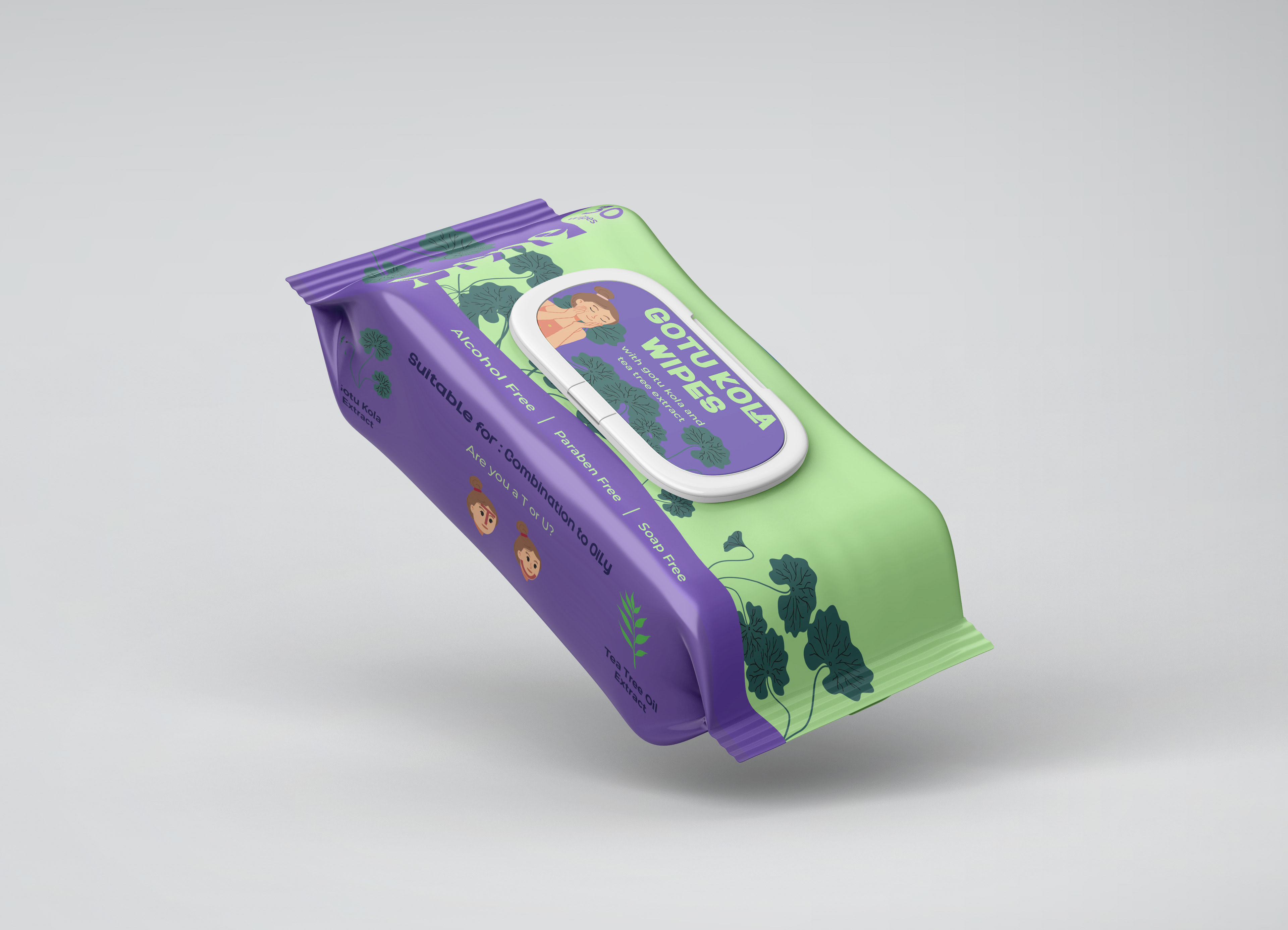
3. Gotu Kola Wipes
It features the botanical illustrations of Gotu Kola to create a fresh, balanced look that feels clean and clarifying. A bright green was chosen to reflect the purifying and refreshing qualities of the ingredients. An illustrated girl is woven into the design to add a sense of approachability and consistency across the range.
It features the botanical illustrations of Gotu Kola to create a fresh, balanced look that feels clean and clarifying. A bright green was chosen to reflect the purifying and refreshing qualities of the ingredients. An illustrated girl is woven into the design to add a sense of approachability and consistency across the range.